3/31/10

If you're in Texas...


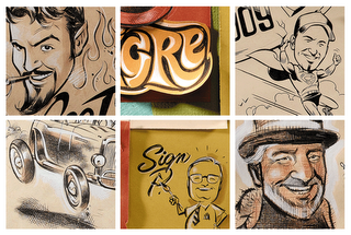
...get your cowboy boots on and head over to Austin Speed Shop on April 9. The actual 32 Ford that posed for this illustration will be there along with some of the House staff. The giant snake that posed for the Luther's type treatment might be close by, so you better be on your toes. ;) Read about it here.

3/7/10

1932...


Man, it's been awhile! Busy busy busy. I humbly offer up this 1932 Ford to the 4 remaining eyeballs that care to visit this lonely place.

7/27/09

More DWELL + an Interview...


The Dwell September 2009 issue is on the racks as we speak! Here's the Arthropod in full color. Many thank you's are in order... thanks to Andy for sliding this in my direction, and to Kyle Blue and Sam Grawe for letting me illustrate this thing in their fine magazine. And a special thanks to Miyoko Ohtake for writing up a nice piece about it here. This was a lot of fun to do. Now, if you hit Miyoko's interview, make sure to click the yellow "slideshow" button to see 7 or 8 process shots while you're there. Thanks!

6/12/09

Dwell Magazine...


Alright, I'm the world's worst photographer... now that I've gotten that out of the way, here's a couple (lousy) pics of a few illustrations in an old issue (July / August 2007) of Dwell Magazine. I was cleaning out the studio and came across the mag and decided to post it up on my neglected blog. There's only a handful of magazines that I enjoy, and an even smaller handful of magazines that I love. I love me some Dwell. It's recently undergone a sharp new redesign thanks to Kyle Blue and the gang out in San Francisco. It looks great and you should buy it immediately. :) I know I've posted these illos previously... but hopefully you'll let me slide since they're in color this time around.


Here's one you haven't seen. Architect Rudolph Schindler's "Westwood Residence" for those of you keeping tabs.

7/25/08

Heads of the House...


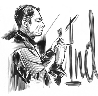
Man, have I drawn alot of people over the years, I could post portraits of people for months if I wanted to bore everyone to death. This one's interesting, it's an old mash-up of the staff at House Industries, we needed 'em for the "bio" pics in the 10 year hardcover book. Some of these cats have moved on, some are still there (like me) and there are a couple new young guns at the studio that aren't pictured here. The first person to name all these mugs left to right gets a free "33 bugsack" mousepad mailed to your house from yours truly. And, due to overwhelming requests, I will lovingly take on commissions to illustrate your favorite family member(s) or super-heroes on nice 11x14 inch paper if you so desire. Click my profile over to the right and drop an e-mail to me at which time I can give details and close-ups of work produced... get 'em in time for Christmas! This post is for my pal Tom Lilly (who's mentioned in my "Design Inspiration" interview to the right) who sent me an e-mail yesterday and kicked my tail for not posting anything new in awhile. Thanks Tom, I need to listen to you more often buddy.

Labels: ,

7/10/08

An homage...


...to Big Daddy from a few years ago. Back when I drew this thing, gas cost about a buck fiddy a gallon, good thing this hopped up shopping cart pulls 13 mpg highway, 10 around town.

3/18/08

Packin' chrome...

2/16/08

Blue scales and Lobster claws...


Ms. Prang hooks the snakes up real nice with some fancy colors, and the armored bug/scorpion/crustacean "33" is all inked up with a little bit of hair and warm butter for dipping.

10/16/07

Blocking it in...


More on this piece a little later... thanks to Mr. Cruz for the pic...

9/14/07

Snakes on a blog...


Some B/W "33" snakes, be sure to scroll down and catch a few other "33's" while you're at it. I have been made aware that snakes don't actually have fangs on the bottom and I've noted it somewhere in the reccesses of my mind...

8/28/07

In progress...

6/2/07

Harry...


Since there's not much hype for Harry Potter, I figured I'd help out by posting a sketch. The ball should get rolling now I imagine. I posted this a ways back on Drawergeeks and thought I'd pop it on here for fun.

Labels:

DRAWN!...

Thanks for the post! I remember when you first began, I said to myself, WOW! A blog dedicated to illustration... and all things creative and wonderful... any minute now they'll get to me and I can show all my friends and my Mom that I'm famous! Well, after a short seven hundred-ish days and nights it's truly happened... I'll cry myself to sleep no more, no longer must my wife wake up with her silky hair stuck to her forehead from my endless tears. Okay now, all kidding aside, thank you very much and as everyone that'll ever stop by this blog already knows, DRAWN! is a beautiful thing. I visit everyday without fail and the inspiration that I get from it is unrivaled. What a fantastic site. So, If you've read this far, wait no more, click the DRAWN link to the right and be transported to a creative wonderland absolutely beyond compare.

5/30/07

Final Inks...


The final piece, uncropped and all. The horizontally extended sky wraps around and becomes part of the inside artwork for the CD. I'll see if I can get some photos up to show a little bit of that. Alright, I've got to get back to the grindstone, armored insects to draw... after I have my Spaghettios.

5/22/07

Inking it up...


Here's a couple in progress shots, I should've taken more as I moved through it. I decided to kill the fussiness around the "7" along the way. It's just about done, for the finishing of the sky to the left of the sign I'll be cranking some "Operation Mindcrime" on the iTunes and laying down some liquid frisket for natural looking stars. After that, throw some ink on there, pull the frisket and we're done. I'll post a couple shots of the workspace and final product in a bit.

Labels: , , , ,

5/21/07

The chosen one...


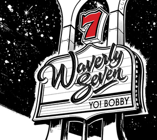
Here's the one I was happy with, I decided to nix the palm trees and background elements in favor of a cleaner piece with nothing to distract the eye from what was important. I think the negative space works nicely (once it's cropped to CD specs... see a couple posts below for the final) The sign has just a little bit of perspective on it to give me a nice space to present the logo and info without too much distortion. To the right of the pic is my loose and final penciling onto illustration paper, now I get to break out the Winsor & Newton series 7's and my ink bottle and get my fingers dirty! Stay tuned and I'll get some stages posted.

5/19/07

Compositions...


Okay, let's try this again... difficulties as of late, So, for the album below it was decided that the band wanted a Las Vegas feel to this due to the Bobby Darin influence. As we all sadly know by now, designers the world over LOVE to slap a martini glass w/ an olive on anything "Vegas" and call it a day. It's gotten almost as cliche' as Marilyn Monroe, James Dean, and pink Cadillacs on anything "50s" There's a heck of a lot more to that decade than Marilyn and Caddy's and there's a lot more to Vegas than a martini. A strip sign might be considered a bit cliche' by some but it seemed perfectly appropriate here as a backdrop for the scripty logo and the "YO! BOBBY" album title. Here's a handful of sign comps that just didn't work well enough.

2/24/07

Waverly Seven!...


Alright, now that I've alienated everyone who's ever stopped at this blog by going a zillion years between posts, I'll begin anew. Since my grandmother is the only one still looking in, (Hi Mamoo!) Okay, I managed to land this great job of designing and Illustrating Waverly Seven's inaugural album, YO! BOBBY. These guys, and gal, are incredible musicians and they've put together a double CD with beautiful jazz interpretations of Bobby Darin songs. I'll add a link to their site in the links bar, you can pop in and take a peek as well as hear a couple of the tracks. This is the cover and over the next week or two, I'll be posting bits on the process of making this thing, I can only hope that my blog friends will return to see it. It was such a great time to work on this, everyone involved is just as top flight as they come. Much Thanks to Colin, Anat, Avishai, Joel, Manuel, Jason, Barak and Daniel, you're all fantastic!

12/23/06

Holidays...


Happy Holidays everybody! I'm a Christmas guy so here's some Santa's. I know that Christmas isn't everyone's thing though, so whichever holiday you celebrate, I wish you a lovely and happy one. Gosh, I'm on a pretty tight art deadline lately and haven't been around much but I should be able to correct this matter in the new year, lots of posts coming up! Thanks for the new comments by the way... Whew, it's 1:30 in the a.m. and I'm still drawing while wrapping presents and trying to steal cookies when my wife is out of the room... I've got to snatch myself a chocolate chip and get some sleep... see you soon. :)

10/17/06

So, you're a TRACER!...


Hey, I hate to admit using the light table here, but when Toyota comes and says they need their two big selling Scions depicted in exacting detail, you don't have much choice. The shapes must be there you know? Besides, anybody who works in this field knows that even though you might want to, sometimes you aint got 700 hours to map it all out with rulers and sun-dials like the great masters would have. So, break out the magic tracing machine, say a prayer to the art gods and get started. Anyway, it's still quite fun to make up all that good shiny stuff and turn real objects into an ink line. And in the end, Toyota is happy.

10/4/06

The close-ups...


See post below... Yes sir, that's the one and only Chris "Coop" Cooper at top left, and the incomparable Rat Fink himself, Ed "Big Daddy" Roth at the bottom right.

House Map!...


This was a time consuming one. When we did the House Industries 10 year book, our AD Andy Cruz wanted a double page spread of an illustrated map that essentially had caricatures of all the past and present "House" employees jammed onto it. It also served as a visual guide to some of the influences that each one of us has. For example, Andy is an avid fan of most things Polynesian, hence the House Tiki Type collection of years ago... so he ended up in Florida at the legendary Mai Kai sipping a fine drink. Different people that we've worked with are scattered around here too. This was done by illustrating all of the pieces onto bits of paper and such, ruffling the edges up for effect and then pasting them onto the US of A, also made of torn paper. Then that whole big mess was attached to a large painted board that stood in as the water. It's probably 5 feet wide. I know things are hard to see, I'll post some close ups in a few...

10/2/06

@#!&in' Slayer!...


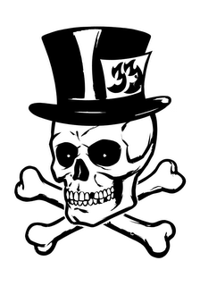
Since it's now October and that creepy crawly candy filled holiday is on it's way, I thought I'd post a skull and crossbones. A good skull seems on first thought to be really easy, it took a some work to get this thing right. Not going for realism here, but sort of that cool skull you always drew on your crappy paper bag book covers in junior high school while listening to Slayer and Iron Maiden... come on, you know you all did it. ;)

10/1/06

Speedball...


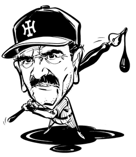
These blogs are loaded with super talent, there are so many artists that showcase incredible character designs, I'm in awe of them... just check the links bar for proof... anyway, I realized that I don't have a single thing on this blog yet that shows anyone from head to toe. I imagine I'd better fix that so here's a caricature from a piece we did on Mr. Ed Benguiat. Ed is a living legend in the field of lettering and type, and a huge Yankees fan, hence the baseball/speedball lettering pen/ink theme. The guy's responsible for the original Planet of the Apes logo, the SuperFly logo and billions of great typefaces that we take for granted today. So, I know the arms/hands stink and his feet are loaves of bread, but deadlines wait for no-one and I promise I'll do better next time. I do like the quick inking style and I learned a lot from this piece which is all we can hope for sometimes.

9/29/06

Suckers!...


Here's another of the 33's. Hopefully it's apparent that it's some form of octopus-ish creature. It's no secret that I'm a monstrous fan of black and white work and I'll jump at any chance to draw and ink up something like this. The "33's" on this blog are works that I've enjoyed tremendously, and there's a lot more on the way. Hope you like 'em!

9/26/06

Charcoal...


This was a piece done for a catalog that showcased a faux fashion mag cover, this was the covergirl. It's certainly inspired by the fashion illustration of many decades ago. I'm planning on doing a truckload of full figures in this manner because this type of illustration needs to make a comeback in a big way. Haven't we all seen enough photography already? The days when illustration ruled the world shall return!

9/22/06

Into the Fray...


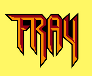
I was talking to my buddy Karl Moline the other day, he's the super talented guy that penciled "Route 666" for the dead and gone Crossgen Comics and before that he did "FRAY" for Dark Horse. Fray was Joss Whedon's (creator of Buffy the Vampire Slayer and Angel) first foray into the realm of comic book writing and it was a great read. Karl got the gig and talked those guys into letting me do the logo. Like the Batman Logos posted below, they're hand drawn letter-forms that are digitized in Adobe Illustrator. If you like good stories and art to boot, go grab up a copy of the Fray series, all the major bookstores should have one lying around the graphic novels section somewhere.

9/21/06

Close-ups...


I always enjoy the "zoom in" so I figured I'd give it a go, liquid frisket is my bestest friend!

9/16/06

Portrait...


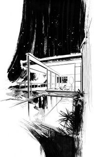
Architect Richard Neutra - (1892-1970) (see his Chuey house in the architecture post below)

9/13/06

Sign Painters...


Sometimes we get an assignment around the studio that requires we do a portrait of a particular person. This is an illustration of John Downer, who's one of the few people left carrying the torch for the art of hand done sign painting. Sadly we live in a world where crappy rectangular vinyl signs with lousy fonts on them rule the day, but that's another story. Back to John, I had to rely on photo reference for this one in order to capture John's likeness. That sometimes brings up the question as to whether or not drawing from photos is a good thing, I think it's fine as long as you don't let your drawing skills erode because you begin to use photos as a crutch. If we must use photos let's learn something to further our skills while doing it and in this case I tried for an illustration style reminiscent of the great Charles Dana Gibson and others in that vein. I think it's reasonably successful.

9/11/06

Bones...


As promised here's another piece of illustrated type for House 33. Note the original logotype real tiny at the top. The sketch is pretty rough since I like to do most of the noodling/finishing while in the inking stage, it allows for some nice things to happen that may not have if I'd refined the sketch to death. The "Bones" T is long gone like the nasty "33" a few posts below. The new 33 line is about to hit and once it does I'll be able to post some more junk, not allowed to tip the hand just yet...

9/7/06

Curves...


There's a book that comes out once a year called "Aphrodisia" which is an "Art of the female form" sort of book. I stumbled across the site during the call for entries the first time around. I completed this piece for it, but alas, it wasn't chosen, and I think the deadline for book 2 is now over. I'll be gunning at book 3 when the competition starts again. Here's a link in case anybody around here wants to send something along in the future... http://www.aristatapublishing.com/ ... I was really happy with the outcome of this artwork though and I've got a series of pieces in the works along these lines.

Architecture...


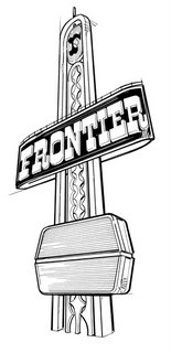
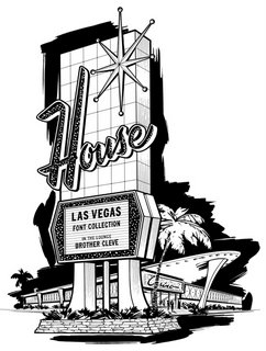
Top: Architect Richard Neutra's Chuey House, next, the classic Vegas Frontier sign and at the bottom, the ficticious "House Industries" casino.

9/3/06

Gee our old LaSalle ran great...


I found this old sketch of Archie, it was for a TV LAND something or other that never went any further than this. I don't know that it's ever seen the light of day anywhere, so here it is.

9/2/06

What're you lookin' at?!...


This was a small spot illo for a House catalog and also my tiny tribute to the ridiculously talented Fritz Willis. (1907-1979)

9/1/06

33 Bugsacks!


Being the illustrator at House Industries is a fantastic thing. The place is loaded with talent and I've grown more as an artist with these guys (and gals) than I could have in a lifetime without them. Now that House33 has hit... (see House33.com for details) ... I get to do artwork for clothing, packaging, toys etc. (I must note, all House33 and House Industries artwork on this blog ©2006 House Industries/Brand Design Co. Inc.) Art Director Andy Cruz concocted the simple idea of illustrating the established "33" logotype in all kinds of interesting ways, so here's some guts and warts and nasty drippings to look at. My wife hates it. It's long since sold out so thankfully somebody likes it. Plenty more "33's" to come. Now all I need is for one of these super-talented Ryan Wood types to paint it up nice...

8/30/06

Final product...


The comics! I was also asked to do the "Detective" and "Gotham Knights" logos which you'll see scattered in the pile.

Batman Begins...


Here's the final sketch of what would become the chosen logo, I have a few alternates that I may post later on. The type isn't a font, it's hand drawn to have a current/updated feel while keeping the original 1940's Bat type in mind. For the finished piece I shortened the ears, changed the direction of the drop shadow on the type and KO'd the mouth altogether. (See the finished product below.) I wrapped it all up by digitizing it in Adobe Illustrator and shipping it off to Gotham.

8/29/06

Whammo!


A few years back I got a call from Curtis King at DC Comics. He wanted new logos for the Batman line of books. It took me all of a nanosecond to say "Jesus Christmas!!! I'll do it!" Jim Lee was starting his run on the book with issue 608, (the "HUSH" storyline for the non-nerds around here...) and that's where this logo first appeared. I wanted the logo to feel new and at the same time harken back to the glory days, not to mention we just had to get Batman's mug back on the thing. This was the greatest gig ever, thanks Curtis! I'll post logo sketches and more Batman goodness a little down the line.

The stone age...

That's where I am it seems. I figured I'd better get one of these fancy blogs before they run out. Figuring out how to use it now...
Free Web Counter
Free Web Counter