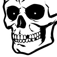
Bones...

As promised here's another piece of illustrated type for House 33. Note the original logotype real tiny at the top. The sketch is pretty rough since I like to do most of the noodling/finishing while in the inking stage, it allows for some nice things to happen that may not have if I'd refined the sketch to death. The "Bones" T is long gone like the nasty "33" a few posts below. The new 33 line is about to hit and once it does I'll be able to post some more junk, not allowed to tip the hand just yet...


7 Comments:
wow loads of great stuff! Awesome blog ! Looks and sounds like you have a fun job. Bookmarked and cant wait to see the next round of goodies!
Cool work! Very inspiring... glad I stumbled across your blog- looking forward to seeing more greatness!!
Cool... Neat to see the original logotype at the top and then see where you went with it.
I really like the ink work & how you designed the bones. Nice stuff, man.
Thanks all! ghettofab, sarah, and ryan, you guys know I love your blogs already and I'm thrilled when you stop in here! Patrick, thanks for the nice words too, I know you're into type a bit as well, I saw you blog and you may know this already but the term for the flip/flop type thing is an "ambigram" Google that term and you'll find tons of 'em but if you want to skip all that and check out the best guy in the world, simply look here... http://www.johnlangdon.net/ambigrams.html
Thanks again everybody.
Chris- thanks for the info on the ambigrams. I had never heard of that before- I found a book years ago with the John Wayne ambigram in it and was amazed by it. I figured there had to be a few more crazies out there that were doing those. Great website you pointed me to... I can't imagine attempting anymore of those, but never say never!
So cool !!
Post a Comment
<< Home