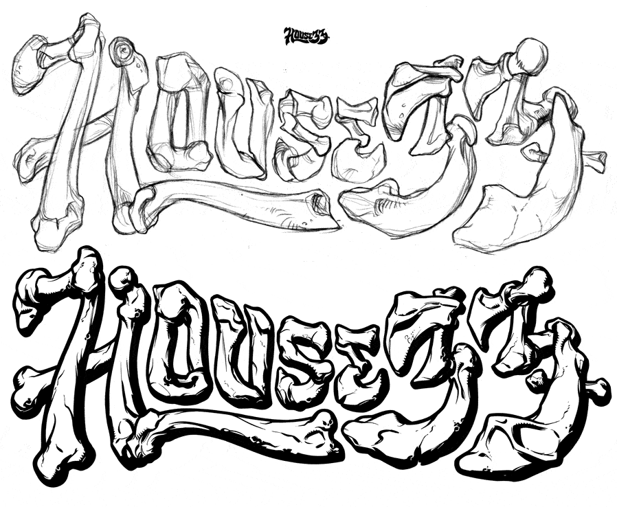
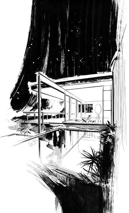
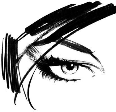
9/29/06

Suckers!...


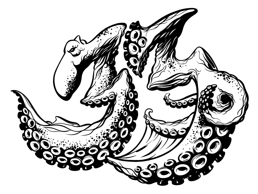
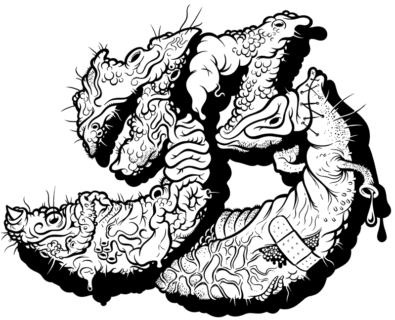
Here's another of the 33's. Hopefully it's apparent that it's some form of octopus-ish creature. It's no secret that I'm a monstrous fan of black and white work and I'll jump at any chance to draw and ink up something like this. The "33's" on this blog are works that I've enjoyed tremendously, and there's a lot more on the way. Hope you like 'em!

9/26/06

Charcoal...


This was a piece done for a catalog that showcased a faux fashion mag cover, this was the covergirl. It's certainly inspired by the fashion illustration of many decades ago. I'm planning on doing a truckload of full figures in this manner because this type of illustration needs to make a comeback in a big way. Haven't we all seen enough photography already? The days when illustration ruled the world shall return!

9/22/06

Into the Fray...


I was talking to my buddy Karl Moline the other day, he's the super talented guy that penciled "Route 666" for the dead and gone Crossgen Comics and before that he did "FRAY" for Dark Horse. Fray was Joss Whedon's (creator of Buffy the Vampire Slayer and Angel) first foray into the realm of comic book writing and it was a great read. Karl got the gig and talked those guys into letting me do the logo. Like the Batman Logos posted below, they're hand drawn letter-forms that are digitized in Adobe Illustrator. If you like good stories and art to boot, go grab up a copy of the Fray series, all the major bookstores should have one lying around the graphic novels section somewhere.

9/21/06

Close-ups...


I always enjoy the "zoom in" so I figured I'd give it a go, liquid frisket is my bestest friend!

9/16/06

Portrait...


Architect Richard Neutra - (1892-1970) (see his Chuey house in the architecture post below)

9/13/06

Sign Painters...


Sometimes we get an assignment around the studio that requires we do a portrait of a particular person. This is an illustration of John Downer, who's one of the few people left carrying the torch for the art of hand done sign painting. Sadly we live in a world where crappy rectangular vinyl signs with lousy fonts on them rule the day, but that's another story. Back to John, I had to rely on photo reference for this one in order to capture John's likeness. That sometimes brings up the question as to whether or not drawing from photos is a good thing, I think it's fine as long as you don't let your drawing skills erode because you begin to use photos as a crutch. If we must use photos let's learn something to further our skills while doing it and in this case I tried for an illustration style reminiscent of the great Charles Dana Gibson and others in that vein. I think it's reasonably successful.

9/11/06

Bones...


As promised here's another piece of illustrated type for House 33. Note the original logotype real tiny at the top. The sketch is pretty rough since I like to do most of the noodling/finishing while in the inking stage, it allows for some nice things to happen that may not have if I'd refined the sketch to death. The "Bones" T is long gone like the nasty "33" a few posts below. The new 33 line is about to hit and once it does I'll be able to post some more junk, not allowed to tip the hand just yet...

9/7/06

Curves...


There's a book that comes out once a year called "Aphrodisia" which is an "Art of the female form" sort of book. I stumbled across the site during the call for entries the first time around. I completed this piece for it, but alas, it wasn't chosen, and I think the deadline for book 2 is now over. I'll be gunning at book 3 when the competition starts again. Here's a link in case anybody around here wants to send something along in the future... http://www.aristatapublishing.com/ ... I was really happy with the outcome of this artwork though and I've got a series of pieces in the works along these lines.

Architecture...


Top: Architect Richard Neutra's Chuey House, next, the classic Vegas Frontier sign and at the bottom, the ficticious "House Industries" casino.

9/3/06

Gee our old LaSalle ran great...


I found this old sketch of Archie, it was for a TV LAND something or other that never went any further than this. I don't know that it's ever seen the light of day anywhere, so here it is.

9/2/06

What're you lookin' at?!...


This was a small spot illo for a House catalog and also my tiny tribute to the ridiculously talented Fritz Willis. (1907-1979)

9/1/06

33 Bugsacks!


Being the illustrator at House Industries is a fantastic thing. The place is loaded with talent and I've grown more as an artist with these guys (and gals) than I could have in a lifetime without them. Now that House33 has hit... (see House33.com for details) ... I get to do artwork for clothing, packaging, toys etc. (I must note, all House33 and House Industries artwork on this blog ©2006 House Industries/Brand Design Co. Inc.) Art Director Andy Cruz concocted the simple idea of illustrating the established "33" logotype in all kinds of interesting ways, so here's some guts and warts and nasty drippings to look at. My wife hates it. It's long since sold out so thankfully somebody likes it. Plenty more "33's" to come. Now all I need is for one of these super-talented Ryan Wood types to paint it up nice...
Free Web Counter
Free Web Counter