8/30/06

Final product...


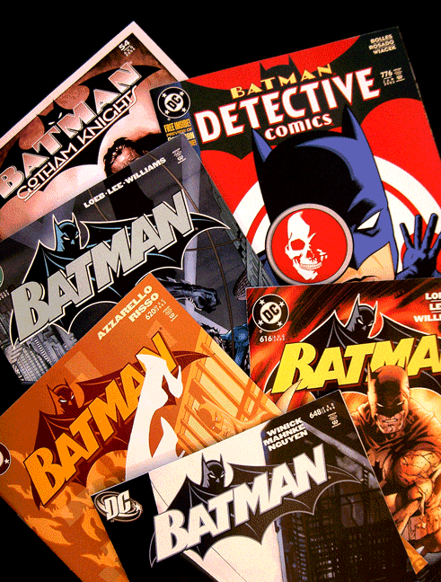
The comics! I was also asked to do the "Detective" and "Gotham Knights" logos which you'll see scattered in the pile.

Batman Begins...


Here's the final sketch of what would become the chosen logo, I have a few alternates that I may post later on. The type isn't a font, it's hand drawn to have a current/updated feel while keeping the original 1940's Bat type in mind. For the finished piece I shortened the ears, changed the direction of the drop shadow on the type and KO'd the mouth altogether. (See the finished product below.) I wrapped it all up by digitizing it in Adobe Illustrator and shipping it off to Gotham.

8/29/06

Whammo!


A few years back I got a call from Curtis King at DC Comics. He wanted new logos for the Batman line of books. It took me all of a nanosecond to say "Jesus Christmas!!! I'll do it!" Jim Lee was starting his run on the book with issue 608, (the "HUSH" storyline for the non-nerds around here...) and that's where this logo first appeared. I wanted the logo to feel new and at the same time harken back to the glory days, not to mention we just had to get Batman's mug back on the thing. This was the greatest gig ever, thanks Curtis! I'll post logo sketches and more Batman goodness a little down the line.

The stone age...

That's where I am it seems. I figured I'd better get one of these fancy blogs before they run out. Figuring out how to use it now...
Free Web Counter
Free Web Counter